Project Overview
Oral Cancer Detection (OC-DETECT) is a mobile-based platform and application that leverage secure, cloud-based technology to provide virtual screenings, photo imagery, referrals, education, and additional communication channels for individuals in India at-risk of oral cancer. This project was completed by Timothy Pang, Ann Smajstrla, Robyn Lee and Emmy Tackett as part of an Industry Design Project collaboration between Springboard and Benten Technologies. Due to a non-disclosure agreement with Benten Technologies, certain project details cannot be shared publicly.
Role
UX research, UX + UI design, prototyping
Constraints
4 week timeline
Unfamiliar culture and customs
Unable to conduct independent research
THE CHALLENGE
Oral cancer (OC) in India accounts for one-third of the global burden of OC cases and mortality and is the third most frequent cancer in India
OC forms in tissues of the oral cavity and is strongly linked to tobacco use (smoking, vaping, or chewing) and is exacerbated by heavy alcohol use
Consumption of smokeless tobacco (SLT) is more prevalent than various smoking tobaccos in India with about 26% of all adults in India using SLT
It is crucial to expand OC screenings and anti-SLT educational materials to implement a timely, appropriate and efficient treatment that will reduce morbidity and mortality from oral cancer
The Solution
Design a mobile application for a student to assist their elder in taking photos for a health screener.
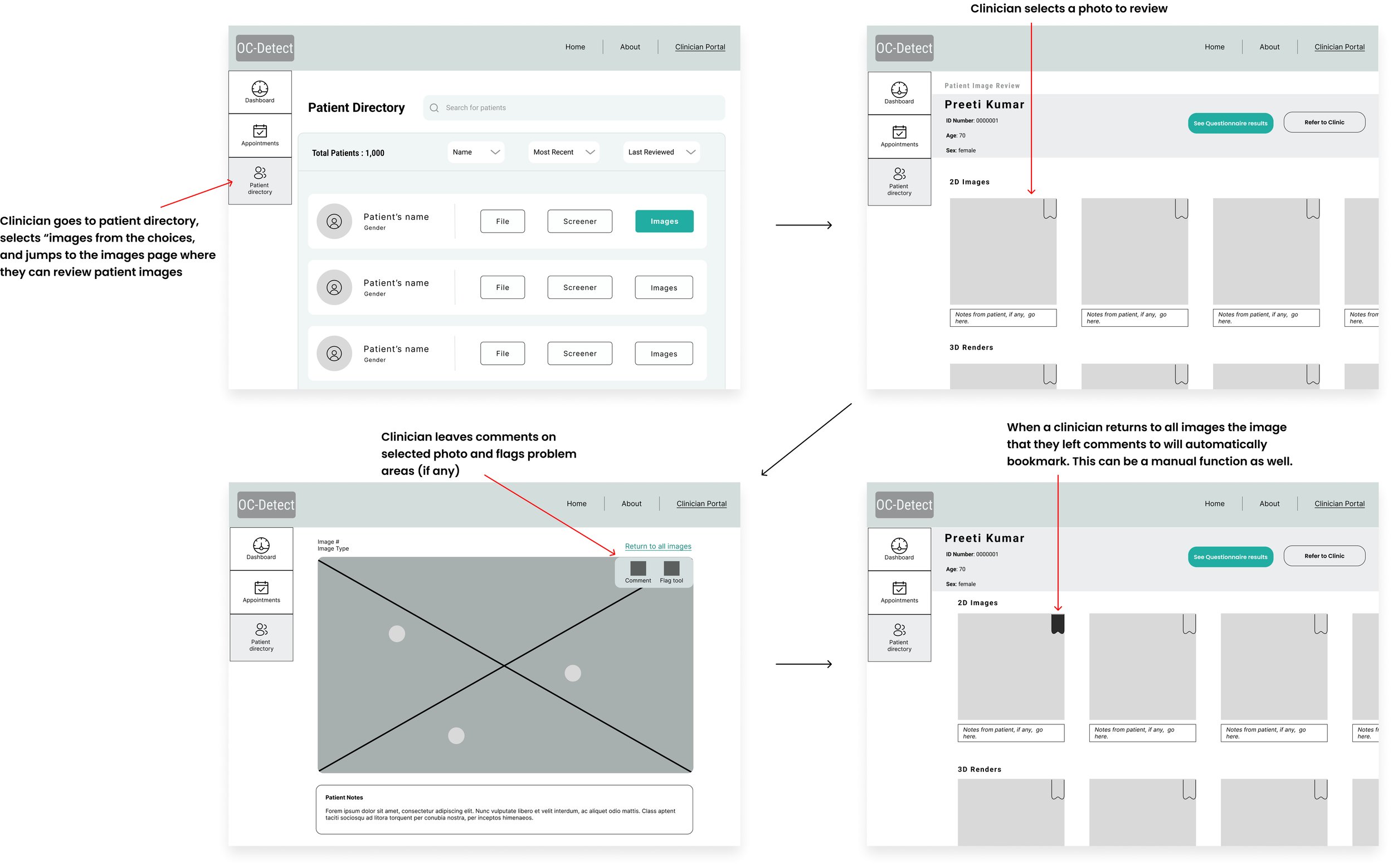
Design a website for a clinician to access the photos and review them.
USER RESEARCH
The Benten Technologies team provided us with their findings from initial user interviews. Individuals who are at-risk for oral cancer and their family members were interviewed about their experiences living with and caring for people living with oral cancer. Additionally, oral cancer specialist were interviewed as well to provide clinical insight.
Insights from Healthcare Provider Survey
70% of respondents believed family members could use a mobile app to screen family members for health conditions
50% of respondents have not been given health condition prevention materials or resources with their patients
If materials were provided to patients, then they received the information from non-online sources
Problems with the Healthcare Provider Survey
Survey conducted study on a low sample size (10) - data may not reflect user beliefs
Survey asked open-ended questions without the ability to follow up with respondents to gather more details
Personas
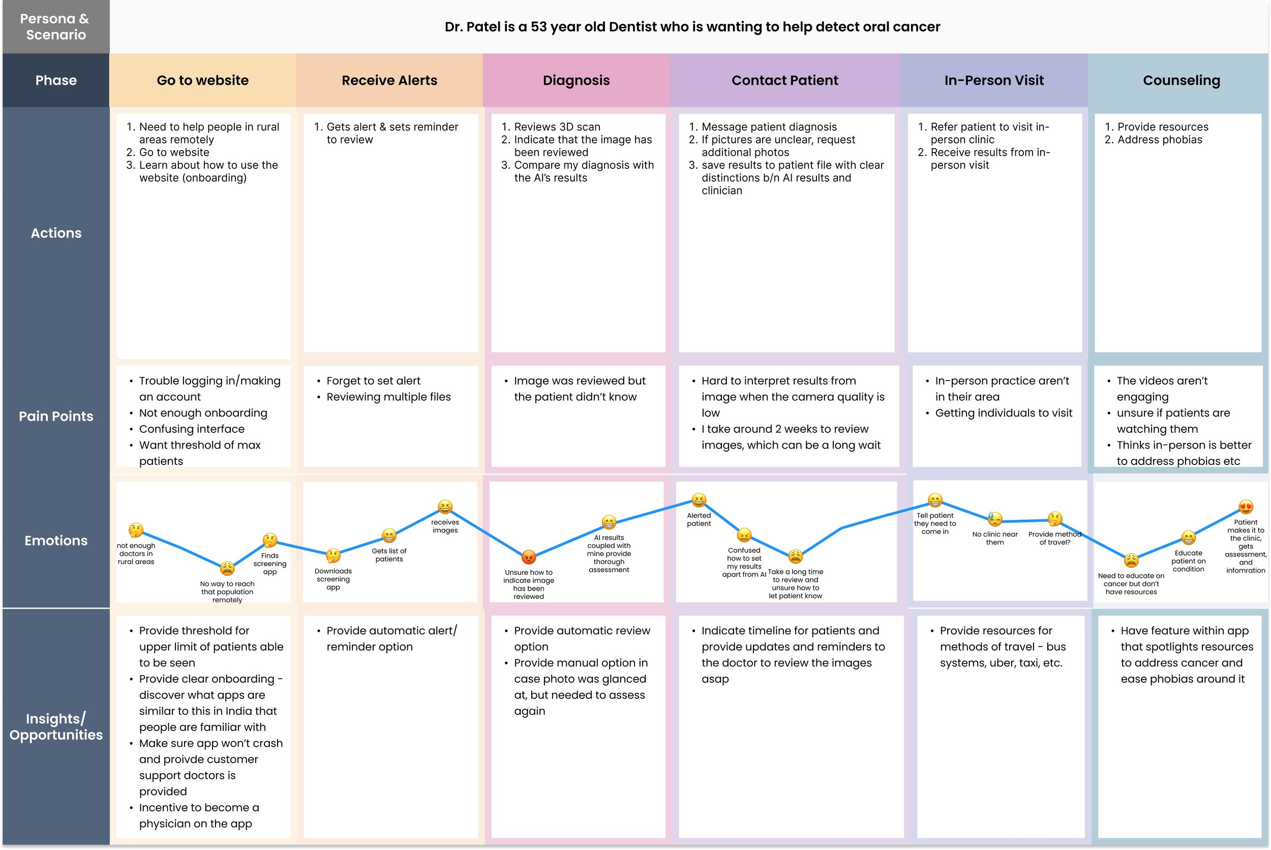
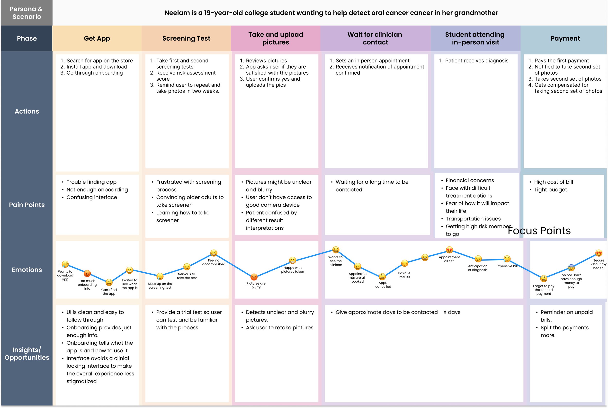
Based on surveys and interviews, we developed two main personas. One is the student who will be using the app to screen their elderly relatives for oral cancer and one is for the oral cancer experts who will be using the app to review the screening and imagery results.
User Stories + User Flows
We solidified the following journeys as a team:
Once the user stories were solidified, we mapped out critical user flows for the application.
Solution
Wireframes
Finally, we were ready to get our ideas down. We started with the big screens and built our flows from there, totaling to about 4 separate iterations
Each round we either added entire flows or significantly edited our screens. The changing needs of the stakeholders and our expanding understanding of how to address the problem better prodded us to keep going back and tweak what we had.
Mobile dashboard screen evolution shown in the above picture. We gradually simplified the screen and tweaked the copy to make each button’s function straightforward.
Screen Evolutions
Website Patient Directory Evolution
Website Dashboard Evolution
Stakeholder requested the screener would be virtual scrolling instead of include a next button
The clinics would permit patients to only be able to select AM or PM, not a specific time
Since the camera function is important, but not used more than twice we decided to move it to the homepage
and not put it on the navigational bar. We hoped this change would reduce cognitive load.
Challenges and Lessons Learned
This was my first experience working on a team of UX designers as opposed to being solo or in a pair. It was rewarding having others to bounce ideas off of and ask questions, and I enjoyed hearing their differing opinions. It did pose challenges being that we were in different time zones, with differing schedules, when it came time to schedule meetings or collaborate.
We overcame these challenges by using Slack as a work management tool, and delegating tasks suited to our strengths so we could work independently at our convenience. If one of us was unable to all attend a meeting, we recorded the meeting so the other could be kept informed. Throughout our collaboration I learned to be unafraid of asking questions or to request clarification.
With various communication styles it is important to be clear on what is being said and meant, and what is expected. It is much better to feel insecure for a few seconds asking a question than to waste time working on a wrong step for the product.
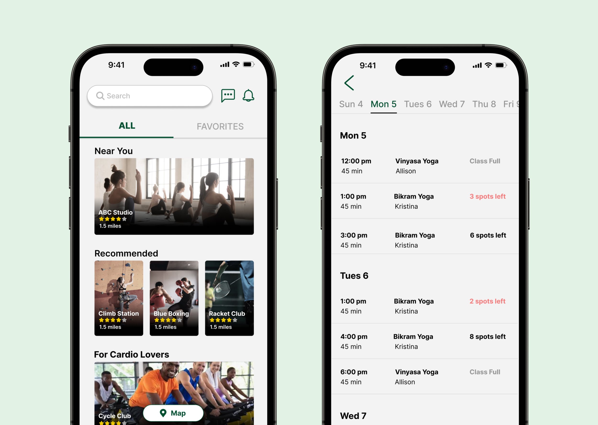
FitNav 💪
Make finding the right fitness class as easy as a few clicks


