FitNav Case Study
Timeline
May - October 2022 ( 12 weeks)
My Role
Solo student project for Springboard UX/UI Bootcamp
THE PROBLEM
With today’s ever growing trend of fitness and healthy lifestyle. Choosing the right fitness class can be difficult and overwhelming due to the enormous amount of options that are available.
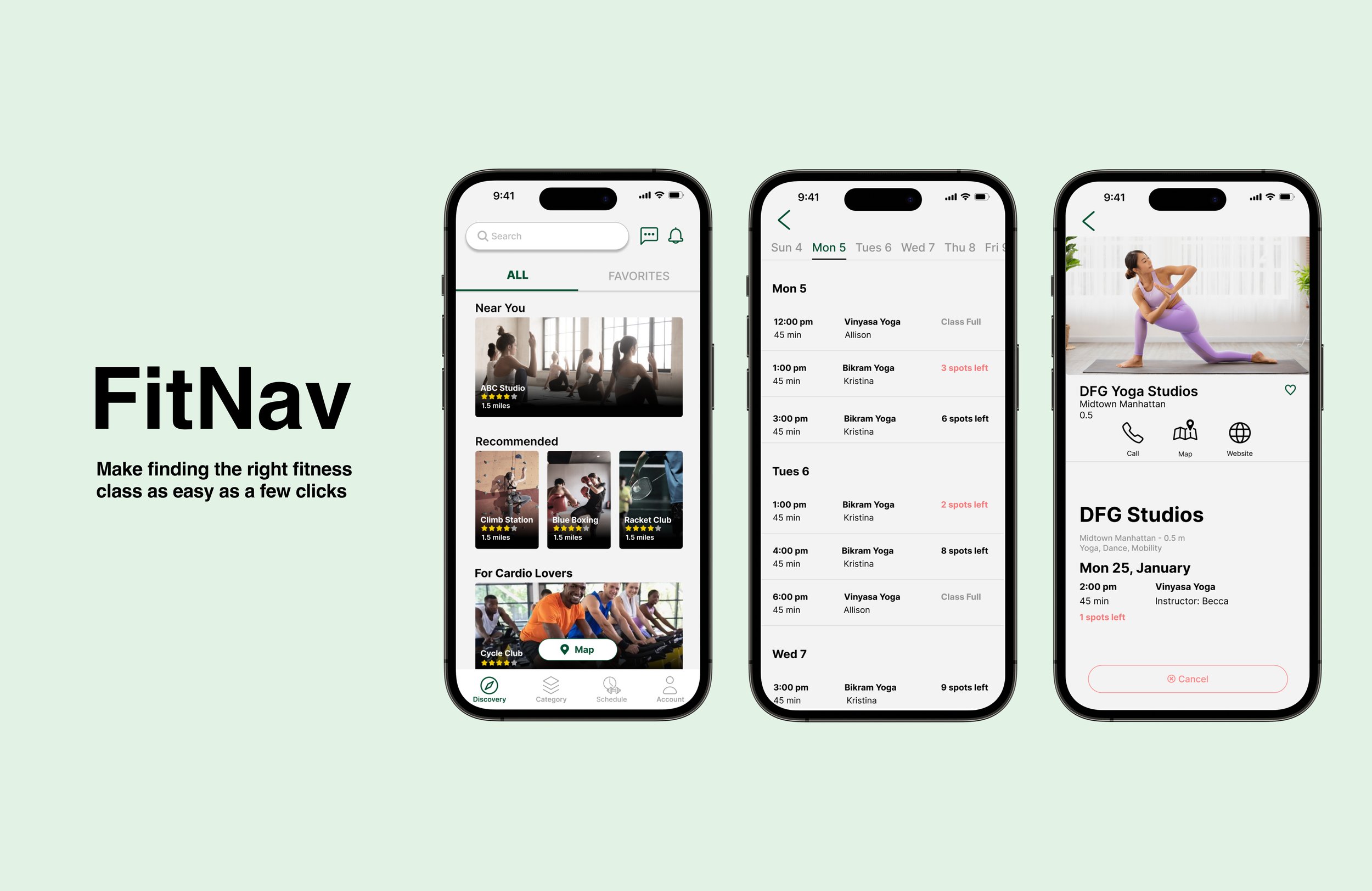
FitNav aims to help connect individuals to the fitness activities and classes they’re interested in and help them to be a step closer to their fitness goals.
THE SOLUTION
An application that…
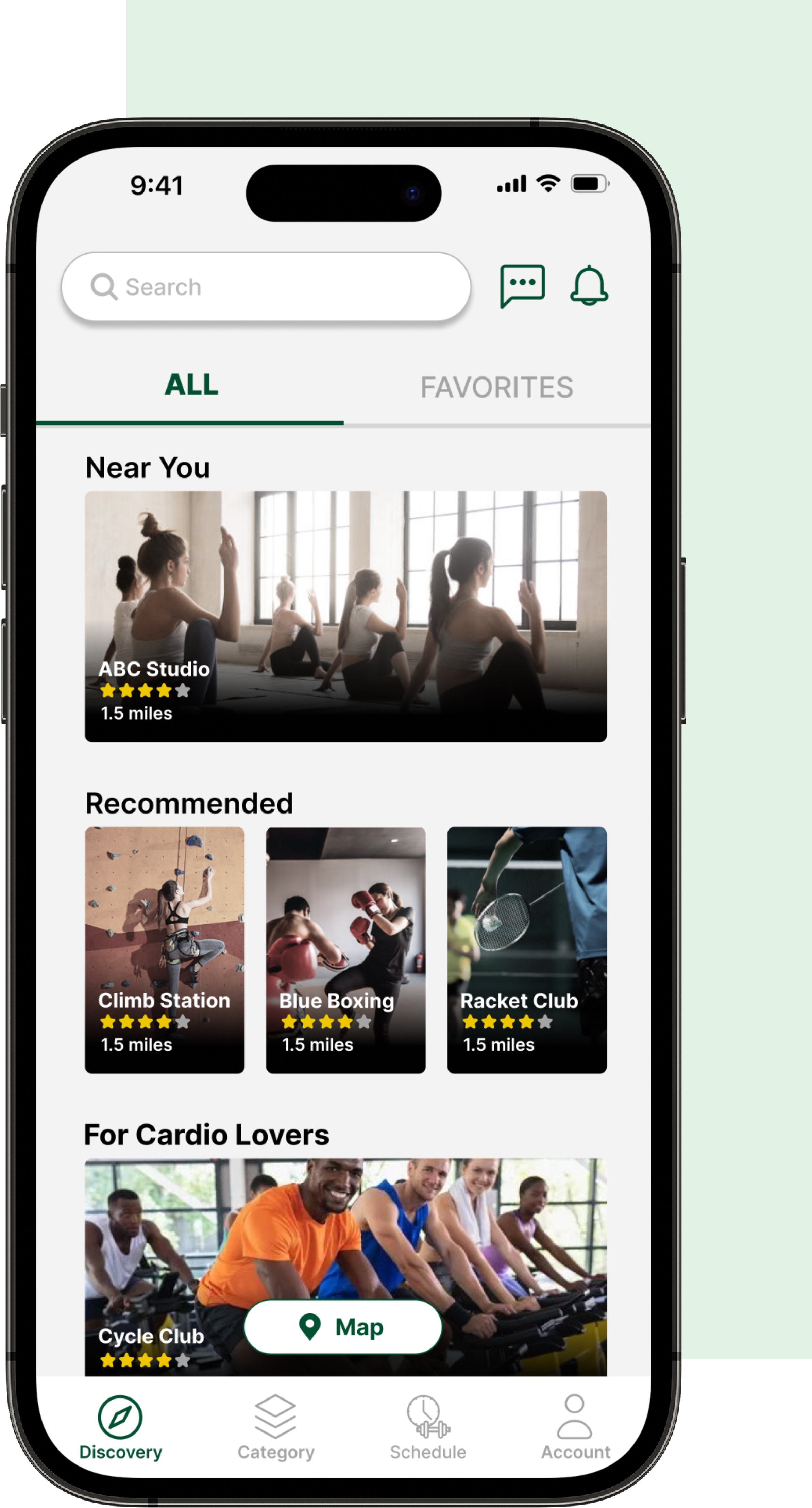
Allows users to reserve the classes based off their preferences
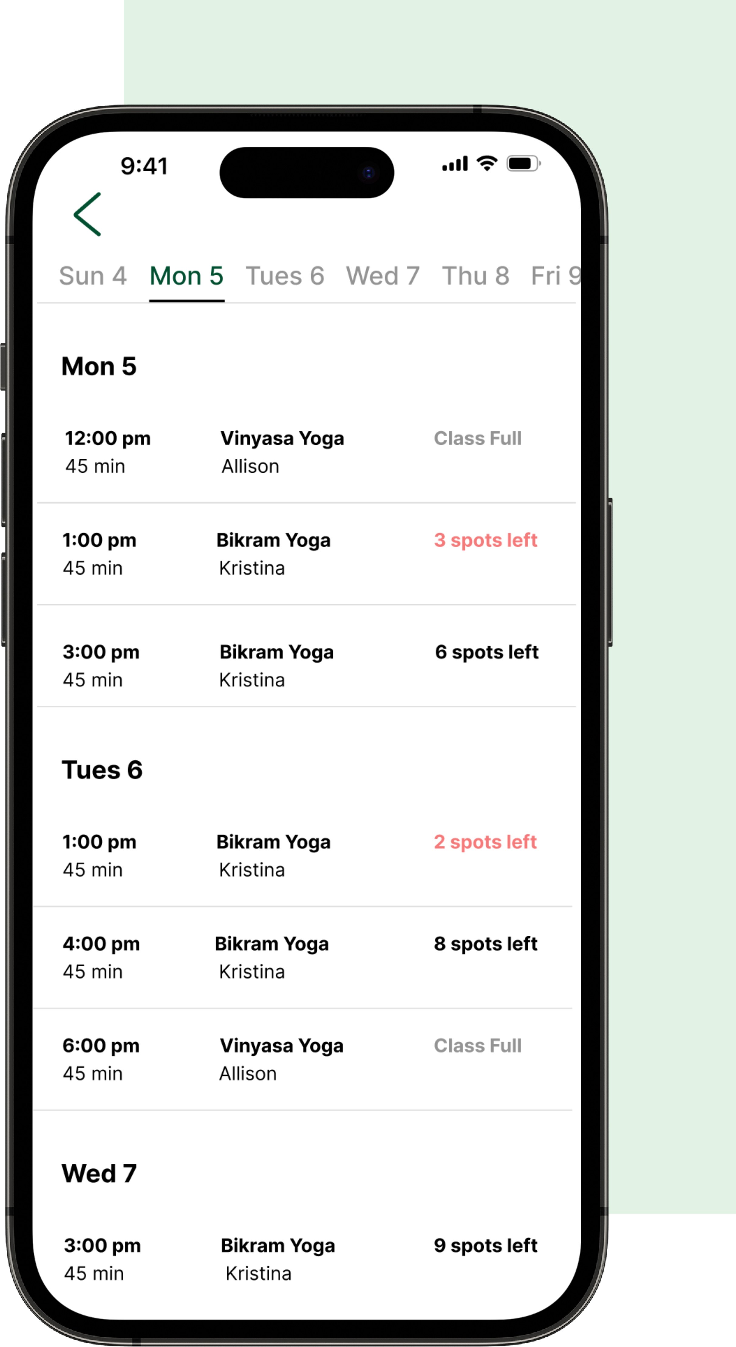
Schedules, instructors and availabilities all at one glance
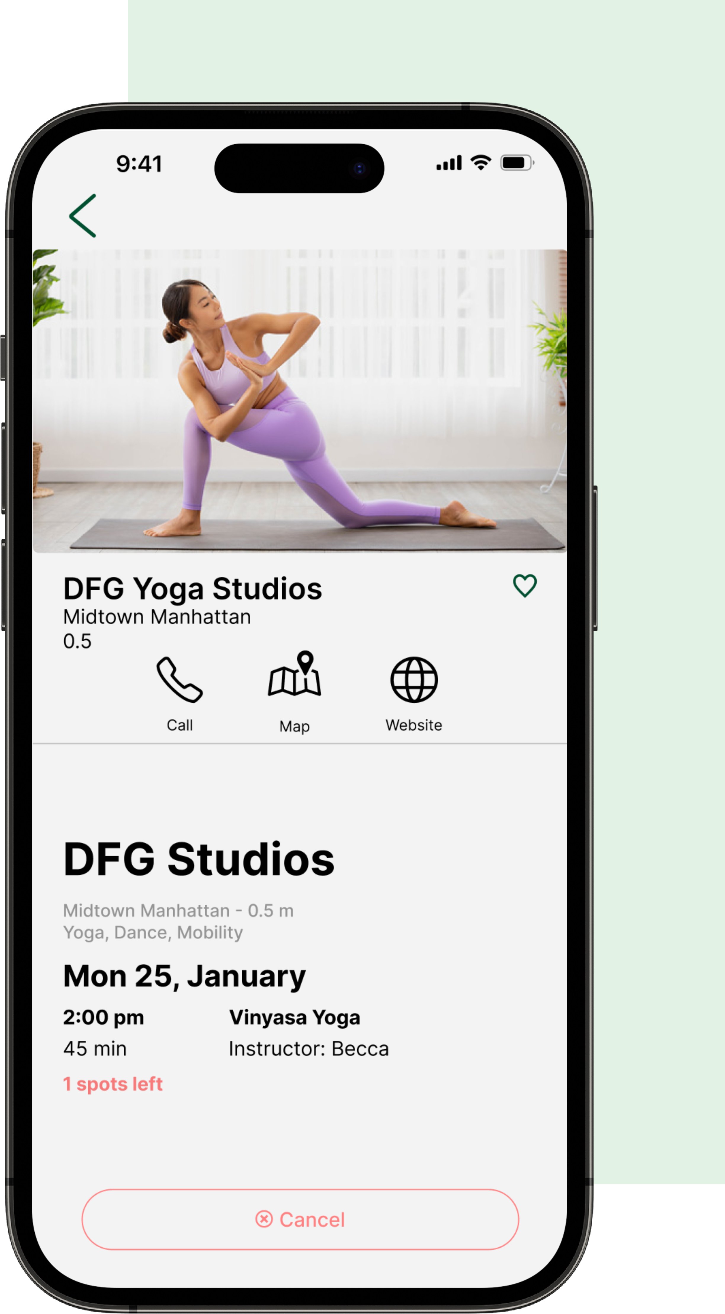
Everything a user wants to know about a gym or a fitness class
WHITE PAPER RESEARCH
What I found in my secondary research was that health and wellness products and services are expected to grow exponentially in the next few years. According to McKinsey & Company:
Research shows that the market for health and wellness products and services is growing by 5 to 10 percent per year, depending on the region.
30 percent of US customers went to the gym or studio at least once in the first two weeks of February 2021
70 percent of fitness consumers report missing their gym as much as they miss family and friends.
USER INTERVIEWS
After carefully analyzing my notes, I created a screener survey that would help me identify the best individuals to interview in order to get some personal opinions of individuals with experience working with a personal trainer. The criteria for the survey included:
What kind of fitness activities do you engage in?
What motivated you to search for a gym/ fitness studio?
What was your process for finding a gym/ fitness studio?
What are some things you look for when searching for a gym/ fitness studio
What was the most difficult part about finding a gym/ fitness studio?
Tell me a time when you were searching for a gym
Affinity Mapping
During the interviews, I gathered valuable feedback from participants regarding their experiences in finding fitness activities and trainers that piqued their interest. This included insights on their preferences for gyms, how they searched for gyms and studios, as well as their interactions with fitness instructors and trainers.
To effectively manage the wealth of information obtained, I employed a systematic approach. I transcribed the insights onto post-it notes and then categorized and labeled them based on common themes and similarities. This crucial step enabled me to methodically structure and organize the extensive and diverse raw data, facilitating the subsequent research stages of developing personas and empathy maps.
THE MAIN INSIGHT
80% of the interviewees mentioned that cost is something that they prioritize when searching for fitness classes.
Interviewees are more likely to visit a gym or studio that is closer to their home
Community and culture both play an important role for interviewees when searching for fitness classes and gyms
cumbersome and inconvenient sign up process discourages users from completing the sign up
Google map is the main resource interviewees use while searching for a fitness classes
Personas
The information I gathered and analyzed from the affinity map helped me zero in on the type of audience and personas I wanted to create in order to represent the user base. These notes were particularly helpful for this process because I got to step into the end user’s shoes and fully understand all of their feelings, emotions, and thoughts as fitness enthusiasts. There are different types of fitness enthusiasts out there and even more different types of humans.
The two personas I created helped keep me balanced between the different types of users and personalities out there and also kept my mind open as to how certain features would benefit different groups. I now introduce: Sean Kim and Margie O’Brien. The traits, needs, and desires of these two opposite personas helped sculpt what to include in the MVP (Minimum Viable Product).
Wireframes
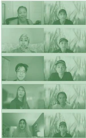
Before investing any more time I stopped and conducted guerrilla usability tests with my wireframes. I ran 5 virtual 1:1 usability test sessions. This helped me know if the perceived mental model of peoples’ expectations (How it seems to work) matched the conceptual model that I had designed (How it actually works).
Testing Sketches
Before investing any more time I stopped and conducted usability tests with my low fidelity wireframes.
Changing buttons into tabs
Based on my mentor feedback, tabs seemed to be a better fit than buttons for a cleaner aesthetic and overall design
Adding details and CTA buttons
Originally positioned class’s info inside the photo
Re-positioned class’s info within the photo to outside of the photo
Added CTA buttons to provide better direction for users
Switching" “Reviews” and “About” position
The “Reviews” section is originally positioned above the “About” section
Upon users feedbacks, it makes more sense to have the “Reviews” section position on the bottom because it gives space for it to expand for users to view more reviews.
The Style Guide
High Fidelity SCREEN
1st Round of Usability Testing
I ran 5 virtual 1:1 usability test sessions. This helped me know if the perceived mental model of people’s expectations(How it seems to work) matched the conceptual model that I had designed (How it actually works).
Label for containers
Users were unsure what each container represents after they filled in the text filed with information
Label allows users to know what each container is for even after they filled the ext filed
Better visibility for selected date in schedule section
Having all dates with the same color makes it difficult for users to know which day is selected
Based on feedback, changing the color of the dates that the user is not on to grey helps users to differential which date is selected
Sign for horizontal scrolling
Indicate horizontal scrolling availability to users by cutting off images on the edge of the page
Users are more likely to scroll horizontally when they see images that are positioned beyond the interface
2nd Round of Usability Testing
After I've conducted my first round of usability tests, I incorporated the feedback I've received and the insights I've gained into my prototypes. I then synthesized my findings, iterated on my prototype designs, and conducted another round of moderated usability testing with five new participants.
Booking info on cancelation page
Users rather see booking informations over class information on cancelation page
Having booking information on cancellation page can reassure users’ decision on cancelling
Encourage users to keep their classes
Based on my mentor’s feedback, the design of the buttons on the cancelation page should encourage users to keep their classes rather than canceling.
Outlining the cancel button can repel users from clicking on it
More visibility for saving profile
Upon feedback, 4 our of 5 of the users wanted a more visible alternative to save their updates after editing profile
A save button at the bottom of the screen was recommended
THE FINAL SCREENS
The final product
CONCLUSION + LESSONS LEARNED
What did I learn
Since this is my first UX project. Everything I’ve done was a learning experience. I was able to familiarize myself with the entire UX process from conducting research to usability testing. Additionally, here are some major takeaways I’ve learned:
All about the users:I was able to practice the mindset of putting users at the center and embrace the fact that I'm not the users, which helped me to put my assumptions aside and do my best to understand the users’ needs, frustrations, motivations and goals.
Iteration is key. Running multiple rounds of iteration for both of my low and high fidelity prototypes really helped to make sure every aspect was designed with intention.
Focus on the problem. At the end of the day, it is your users' pains that you will be solving for so keeping that front of mind is important as it's easy to lose sight of this when you're bogged down in the day to day.
What would I’ve done differently
If given more time, I would have liked to speak to more users to gain deeper insights to better integrate all the features together and create a workable prototype for my latest design.
Ending Results and Next Steps
The reactions from both rounds of testing were positive. People liked FitNav’s idea and appreciated the value it has. It is a strong possibility that this app would be successfully adopted by fitness enthusiasts.
Next steps would be to refine this prototype and release a beta version for a few people to use. This would help me learn how likely people would realistically choose to use this platform and find the pain points it can still get better and more useful.
See other work
