Responsibilities
User Research
UX design: Crazy 8s, Wireframing, Prototyping
UI design + Iterations
Project Context
Designed in 5 days: Winter 2022
Solo Project
A project dedicated to Gramcity - a photo location finding app
GV Design Sprint
I completed a 5-days Google Ventures design sprint to quickly create prototypes so that the company could determine if they wanted to go through with the designing or not. The illustration below shows the overall process and the tasks for each sprint.
DAY 1: UNDERSTANDING THE PROBLEM
Project Goals
User Goals
Locate a photo-op at anytime and anywhere
Share favorite locations and photos with others
Business Goals
This new feature should be a stand-alone function, but we wish to see a referral back to our original product - a photo editing app.
Map and Problem Statement
I mapped out a possible end-to-end experience a user might have with the product to understand the user needs and articulate specific questions that need to be addressed in the design.
How might we help users find the type of photo-op they like?
How might we motivate users to share their photos on the platform?
How might we reduce the conflicts between taking photos and traveling?
DAY 2: COMING UP WITH IDEAS AND SOLUTIONS
Lightning Demo
To better understand the market, I researched on apps that has a similar theme as GramCity or solve similar problems. By doing that, I was able to get ideas and inspirations that I could use in the framework I created. The 2 competitors that I chose to do the demos on were:
Spots: Amazing Photo Locations
Spot
Crazy 8’s
After the lightning demo, I spent 8 minutes hashing out 8 different solutions to categorize photo-ops, after which I was able to decide which I should proceed with. To create an intuitive design and to approach the product goals, I decided to highlight the following function in the product:
A Stand-out search function
Quick switch between pages
Minimalistic layout
Logical way to categorize each type of location
Day 3: Deciding
As a solo designer for this sprint project, instead of pitching my design ideas with my teammates, I reviewed all the design ideas from yesterday, evaluated them, and fleshed out a storyboard for the final solution I chose.
Design Strategy
Below are the design strategies used to align with the product goals and to answer the problem statements.
Categorization: Different categories and types of location that helps the users find their desired photo-ops more easily.
Location Guide: Users could add variable photo-ops to the map, and the system will calculate the best route for them according to what travel methods they chose.
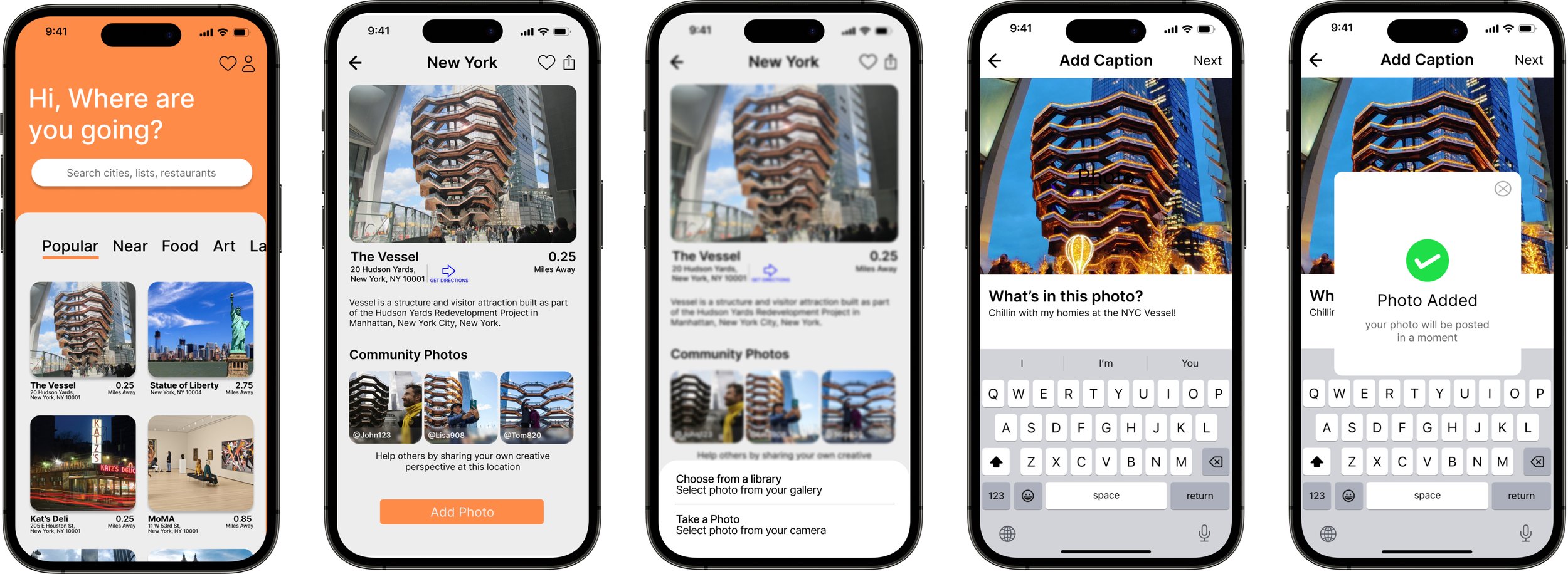
Sharing Images: The newly posted photo will feature on the “Community Photo” section where other people can see when they click on the detail page of this photo-op.
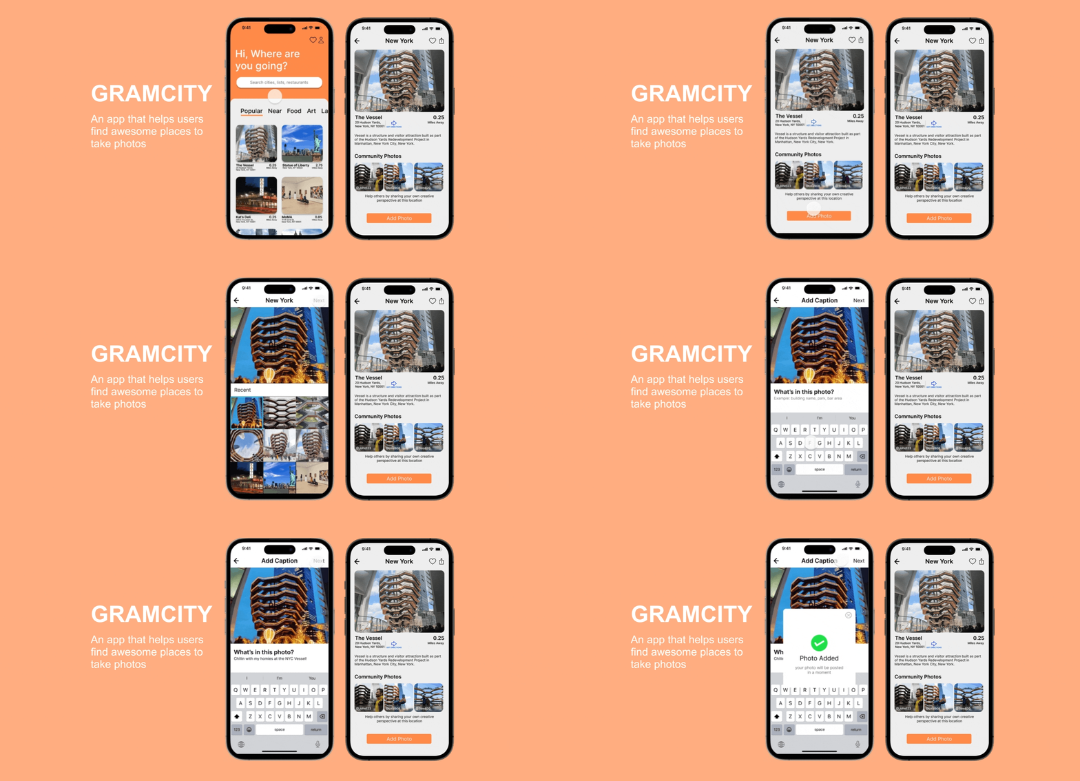
Then, I created a storyboard and a wireframe sketch that show exactly how the user will step through the prototype within a scenario, click by click.
DAY 4:Prototype
Prototyping has always been the part that excited me the most in a UX process, and I aimed to create a realistic facade that I can put in front of the users to gauge their reactions to my idea. To make sure the users can navigate and follow the flow with ease, I designed the UI aspects with the following:
The maximum white space reduced content overload.
Straightforward navigation with both icon and text labels
The primary green is only used on CTA buttons or pop-ups.
DAY 5:test
On the final day of the design sprint, I met with 5 of my participants and conducted moderated remote testing. By having them all think out loud and being able to follow the movement of their cursors, I was able to hear and see each test participant’s preferences as well as their pain points.
Final Prototype
Figma Prototype
Reflections
My overall design sprint experience was very refreshing. The time restrain really helped to challenge my work flow efficiency and creativity. It would be interesting to practice this process with a team on a real product.
For my next steps, I would iterate on my usability test findings. This includes changing the direction icon and make it more visible.
Although with an intense schedule, user testing is the key to discover the issues in the initial design that I would not have discovered. During the testing session, I should have avoided using the words that directly suggesting an action to the users. Lesson learned!
See other work
FitNav 💪
Make finding the right fitness class as easy as a few clicks


